Thoughts on Current Market Valuations
The U.S. stock market’s performance since the coronavirus outbreak has been puzzling to say the least. Following the crash in March it quickly bounced back, and has continued to rise since, despite the protracted covid-induced chaos. Does this all make sense or are we in a bubble?
***
In my last post, I reviewed what I consider to be the defining legacies of the Post-GFC/Pre-Coronavirus era. An 11-year cycle defined by the lowest interest rates in history, an associated hunt for yield that drove investors into ever-riskier asset classes, and the longest equity bull run on record. All of which ended in early 2020 when, as the coronavirus pandemic became a frightening reality, the markets crashed spectacularly, leading to the fastest stock market plunge on record.
It is only natural that many, myself certainly included, were worried that the unwinding of a decade of excesses would have devastating consequences for the world economy, particularly in the face of a long-lasting crisis dictated by a pandemic which had no clear end in sight. I remember feeling very concerned and anxious.
But the aftermath of the crash, from the standpoint of the financial markets, has been baffling. From its lows at the end of March, U.S. stock markets began to rebound, embarking on the most surprising of recoveries. By the end of the year they had not only recovered to their pre-crash levels, but in some cases surpassed them by a considerable amount. And the rebound wasn’t limited to the equity markets, rather it occurred across almost every asset class. The hunt for yield had come back with a vengeance, and shows no sign of abating.
How is it possible that, despite the chaos that engulfs the world, the markets have performed so strongly? Have the markets completely divorced from reality? This post is aimed at trying to make sense of current market valuations, with a view to anticipating its future moves.
2020: Markets Whiplash
It’s helpful to remind ourselves of just how wild the stock market’s journey in 2020 was. Let’s start with the crash. As I showed in my last post, this was possibly the fastest crash in financial market history, beating the crashes of 1929 and 1987. If we look at the ranking of largest single day point drops, 2020’s crash takes up three of the top ten slots, tied with the 1929 crash and one more than the 1987 crash. By any measure, the 2020 crash was major.
But it is precisely with this backdrop in place that the recovery is so baffling. If there is one word that describes the markets’ move it would be: whiplash. On March 24th, the U.S. Congress passed the Coronavirus Aid, Relief, and Economic Security Act, also known as the CARES Act. The gigantic $2.2 trillion stimulus bill included $300 billion in one-time cash payments to individual Americans, $260 billion in increased unemployment benefits, the creation of the Paycheck Protection Program that provided forgivable loans to small businesses, and a series of other stimulus measures.
Comforted by the enormity of the stimulus bill, stocks started to recover. And boy did they recover – by early June the Nasdaq had already returned to its pre-crash levels, whilst the S&P followed suit only a few months later. In fact, when the dust had settled, the stock markets had achieved the fastest recovery in history.
The fastest crash in history followed by the fastest recovery in history. Whiplash.
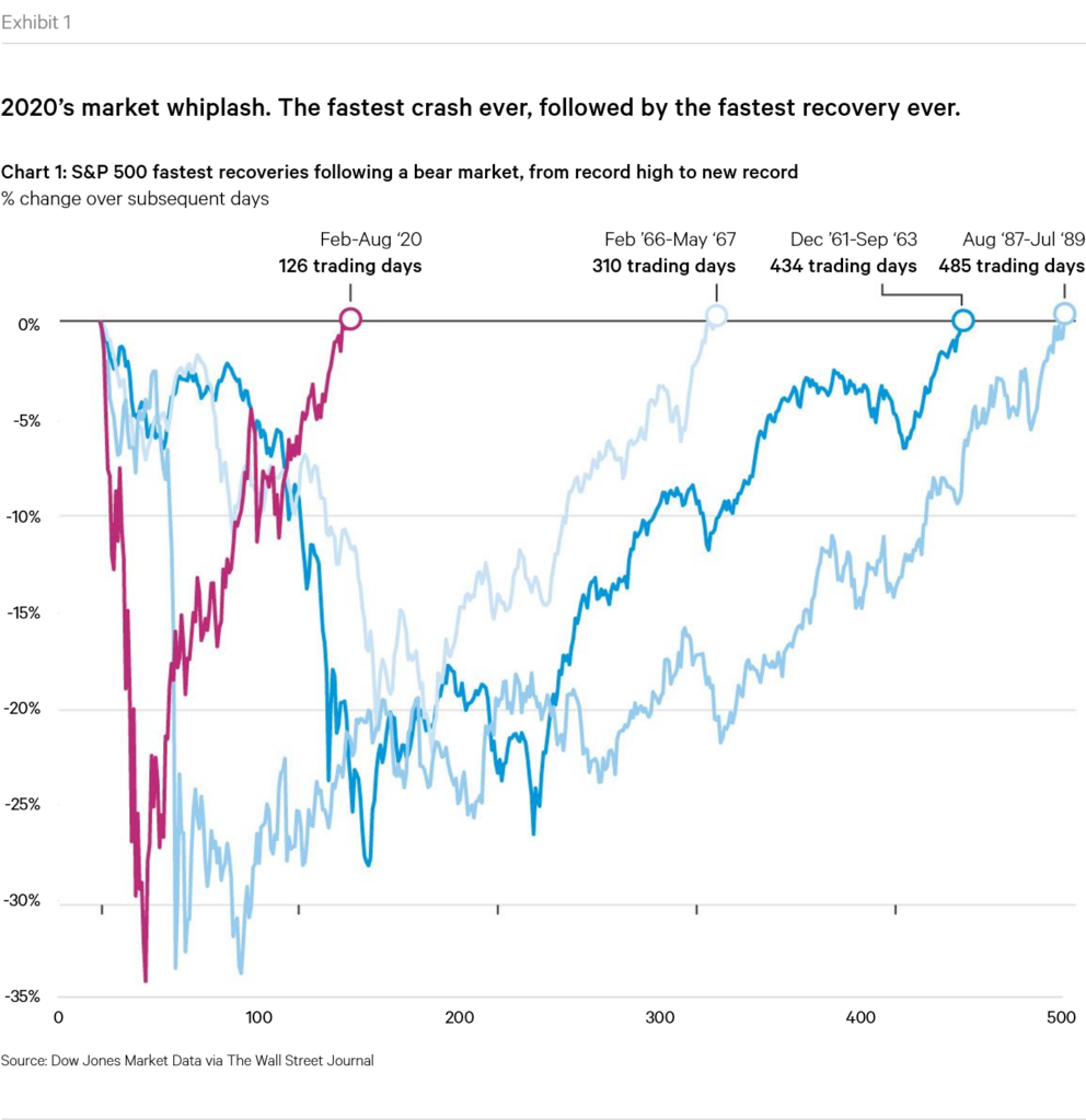
But it didn’t stop there. Having recouped the losses from the crash, stock markets kept on going. By the end of June, U.S. stocks had posted their best single quarter since 1998. By July, the Nasdaq had already set a new record high, and across the world in China, stocks had reached their highest level in five years. A few months later the Dow Jones broke through 30,000 for the first time ever whilst Japan’s Nikkei hit its highest level since 1991. November, following the first COVID vaccine announcement, proved to be the best month ever for a number of indices around the world, including the MSCI ACWI (+12.2%), the Russell 2000 (+18.3%), and the Stoxx Europe 600 (+13.7%).
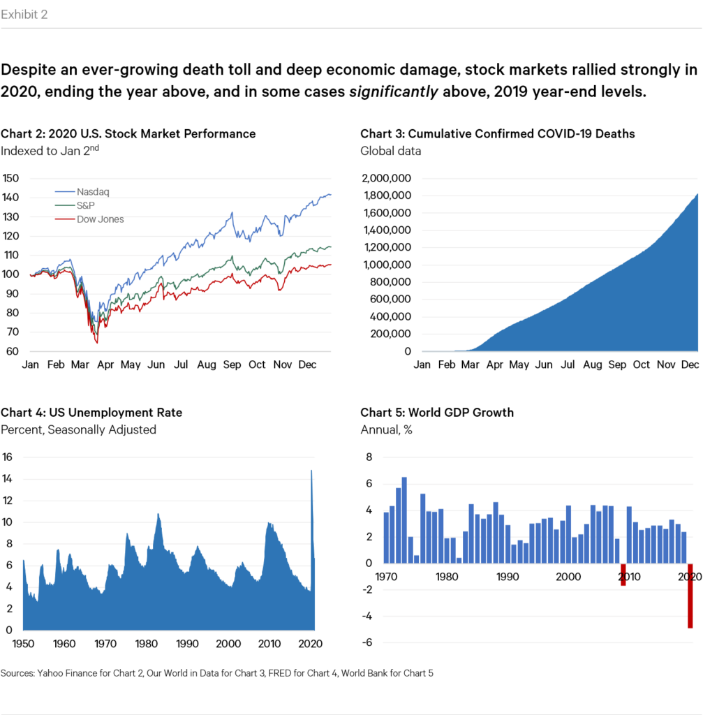
By the end of the year, U.S. stock market indices closed the year above, and in some cases significantly above, their 2019 year-end levels.
The Mother of All Recoveries
Perhaps mayhem is overly-extreme an adjective to describe the state of affairs in 2020, but I don’t think it’s too far from the truth. It is with this in mind that the stock market’s performance is so surprising. Stocks roared on despite all the negative events that surrounded them. Let’s remind ourselves of some of them:
- The world locked down. At one point, the AFP estimated that more than 3.9 billion people, or half of the world’s population, had been asked or ordered to stay at home by their governments to prevent the spread of the virus.
- Oil prices went negative. In April, the price of U.S. oil turned negative for the first time in history, with the price of a barrel of West Texas Intermediate (WTI), the benchmark for U.S. oil, falling as low as minus $37.63 a barrel. In other words, oil producers were paying buyers to take the commodity off their hands due to fears that storage capacity would run out. An energy analyst summed it up nicely: “this is off-the-charts wacky”.
- Unemployment skyrocketed. By the end of April, more than 30 million Americans, equivalent to 19% of the total labor force, had filed for unemployment benefits. For context, during the Great Recession the figure reached 10%.
- The Fed started buying corporate bonds. To support bond market activity, in May the Federal Reserve began buying corporate bond ETFs. It had never done that before, crossing a subtle but significant dividing line between the realm of central bank activity and the “real world”.
- Geopolitical tensions. The “West”’s relations with China took a turn for the worse in May/June when the country cracked down aggressively on a wave of pro-democracy protests that broke out in Hong Kong, threatening the territory’s status as a global financial hub.
- Major social unrest. In June, following the killing of George Floyd by police officers, a wave of mass protests and riots broke out across the United States, and even spread to the rest of the world. Polls in summer 2020 estimated that between 15 million and 26 million people had participated at some point in the demonstrations in the United States, making them the largest in U.S. history.
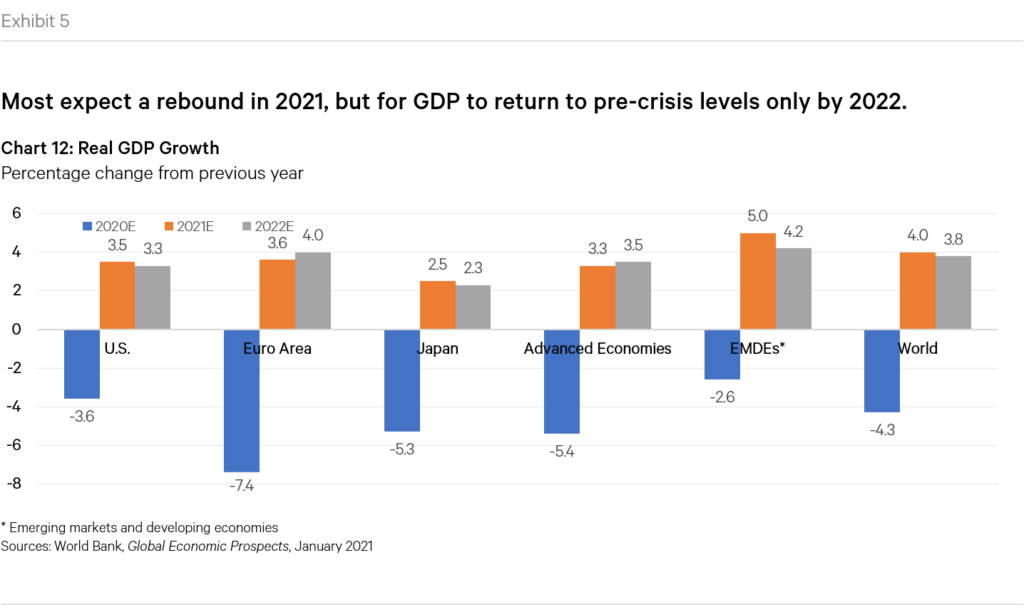
- The worst recession since WWII. In January 2021, the World Bank released its Global Economic Outlook which confirmed that COVID-19 caused a global recession whose depth was surpassed only by the two World Wars and the Great Depression over the past century and a half. In all, the global economy is estimated to have contracted 4.3% in 2020, with the advanced economies having fallen 5.4%.
- A credit crisis looms? 2020 saw its fair share of high profile bankruptcies, including companies like Neiman Marcus, JC Penney, Norwegian Air, Chesapeake Energy, and Hertz. In fact, by July S&P had initiated nearly as many credit downgrades as the entire 2007-08 financial crisis. In the context of the enormous debt pile discussed in my last post, fears of a massive credit crunch loom large.
The list above is just a limited selection. I could have included many more. But the point is that stock markets just didn’t seem to care. They kept on rising. But does this all make sense? How could equity markets perform so strongly despite the chaos surrounding them? Are we in a bubble?
Are We in a Bubble?
There are a multitude of different metrics analysts use to assess the “fair value” of stocks. I am not in a position to pass judgement on which are most correct/effective so I’ll use four of the most commonly referenced metrics.
CAPE Ratio. The most popular metric used by market analysts is the Price-to-Earnings (“P/E”) ratio, which compares the price of a stock to the earnings of the company in question. Whilst useful, the P/E ratio suffers from one principal flaw, which is that earnings can be subject to strong fluctuations depending on the economic context in which they are occurring. So for example, during the GFC of 2007-08, earnings for companies in the S&P 500 fell to almost zero. Despite strong declines in stock prices, P/E ratios rose to nonsensical figures. As such, when performing longer-term analysis, analysts have coalesced around a metric referred to as the Cyclically Adjusted Price Earnings (“CAPE”) ratio. Developed by Nobel prize winning economist Robert Shiller, the CAPE ratio (also sometimes referred to as the “Shiller ratio” or “P/E 10 ratio”) is calculated by dividing the price by the average of ten years of earnings (moving average), adjusted for inflation.
Buffett Indicator. Another commonly cited metric is the so-called “Buffett Indicator”, named after famed-investor Warren Buffett who claims this as his favorite indicator. The Buffett Indicator is simply the ratio of the total stock market valuation to GDP.
Tobin’s Q. A third commonly cited ratio is Tobin’s Q (also known as the “Q Ratio” and “Kaldor’s V”), which was first introduced by Nicholas Kaldor in 1966 but popularized by Nobel prize winning economist James Tobin a decade later. It measures the ratio between the stock market valuation of companies and their net worth measured at replacement cost. Replacement cost means the book value of a firm (or market’s) assets. At its most basic level, the Q Ratio expresses the relationship between market valuation and intrinsic value.
Mean Regression Model. Mean regression simply tries to capture the current stock market’s performance relative to historical movements. Whilst simplistic, it is generally true that long term stock market returns tend to adhere to predictable upward trends, so if short term moves are strongly out of line with historical longer term trends, this can suggest overvaluation.
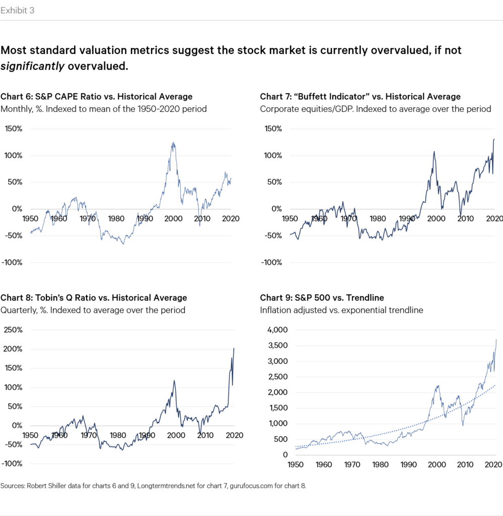
As shown above, all the most common measures of market valuation suggest that the market is overvalued, arguably by a considerable amount. This therefore suggests that we are indeed in some sort of a bubble. But could there be legitimate explanations for the current level of valuations? In general there are three main justifications in circulation. Let’s go through them.
A Tech-Driven Bubble?
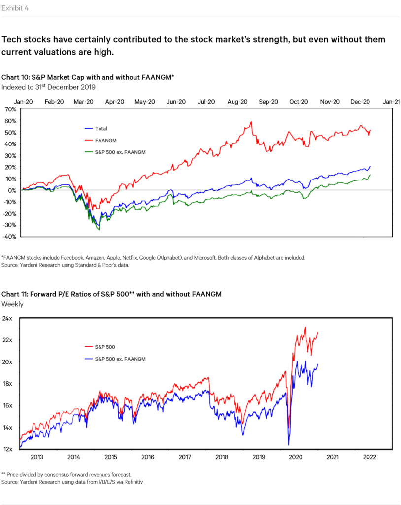
The first commonly cited justification for current market valuations is that they are driven strongly, if not almost entirely by the valuations of a few technology/growth stocks. In particular, analysts point to the so-called FAANGM stocks, which include Facebook, Amazon, Apple, Netflix, Google, and Microsoft. The argument is that these stocks alone are driving most of the overall index’s gains, and that were one to strip them out, the picture would look far more sombre or reasonable. But is this true?
As the charts below show, it is indeed true that these stocks have witnessed incredible appreciation over the last year or so. We could of course spend time assessing whether or not these moves are justified or whether they constitute bubble-behavior, but for our purposes this is beside the point. Because as can be seen in the chart, even stripping out these stocks, the rest of the S&P has still performed extremely well, and is above its 2019 year-end levels. The FAANGM stocks have therefore certainly contributed to the market’s moves, but do not explain them entirely. Even excluding these stocks, we still see valuation levels that are much higher than their pre-cash equivalents.
In fact, turning away from stocks altogether, the post-crash markets saw rallies in just about every asset class, suggesting that something more fundamental is at play.
A Surge in Growth?
Another possible explanation for current valuations is that we are on the verge of a surge in economic growth, spurred by the collective actions of central banks and governments around the world. After all, the sum of the stimulus packages enacted so far is well into the trillions.
This is a difficult theory to assess, not least because we are still in the midst of the pandemic and its full effects have surely not yet been fully borne out. But current stock market valuations imply very strong economic growth in the coming years, something which is difficult to imagine given the current state of affairs. After all, the pandemic hit on the back of a decade of feeble economic performance across the world, and so a move to structurally higher growth rates would require a series of major, fundamental changes that I find difficult to envision. The World Bank’s latest Global Economic Outlook sums this up well:
“Following the devastating health and economic crisis caused by COVID-19, the global economy appears to be emerging from one of its deepest recessions and beginning a subdued recovery. Beyond the short term economic outlook,…policymakers face formidable challenges—in public health, debt management, budget policies, central banking and structural reforms—as they try to ensure that this still-fragile global recovery gains traction and sets a foundation for robust growth and development in the longer run.”
In summary, whilst a golden age of growth could in theory ensue, it doesn’t feel highly probable. Therefore, pricing this in to current valuations is either imprudent or not the real reason why valuations are what they currently are. I suspect it’s more the latter.
Accounting for Interest Rates
In my last post, I went over the notion of the risk free rate of return and its vital importance to the financial markets. As I discussed, the risk free rate plays a fundamental role in driving valuations since it determines the present value of future cash flows. The lower the risk free rate, the lower the discount factor, the higher the value of future income streams.
I also discussed in my last post how the years since the GFC have been extraordinary from an interest rate standpoint, in that they were characterised by the lowest level of rates in financial history. This in turn created a hunt for yield that pushed investors into other, riskier asset classes, driving up their prices. My discussion was focused on the post-GFC/pre-coronavirus era, so what has happened to interest rates this year?
The answer is that in the immediate aftermath of the crash, central bank action led rates to fall even further, to near-zero or negative levels across the “developed” world. In the last few months they have since recovered to roughly pre-crash levels (the chart below, courtesy of the Federal Reserve Bank of St. Louis, only displays data to November 2020. Since then rates have recovered).
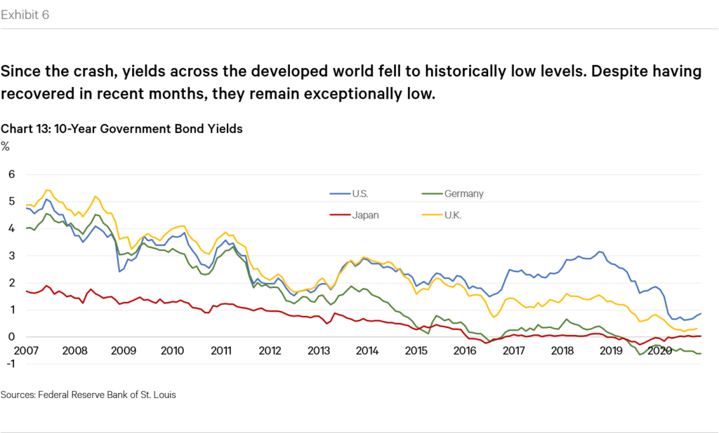
The exceptionally low levels of interest rates has been cited by many as the reason for the high valuations of equities. After all, if yields are so low, wouldn’t it make sense for equities, and other asset classes, to reprice relative to these quasi-zero interest rate levels? Harking back to the valuation metrics discussed earlier, none of these consider the effect of interest rates in their calculations.
The above logic has not gone unnoticed. Robert Shiller himself, the father of the favoured CAPE ratio discussed earlier, analyzed the relevance of interest rates in a recent article which has created much clamour. In the article, aptly named “Making Sense of Sky-High Stock Prices”, Shiller and his co-authors acknowledge that “There has been much puzzlement that the world’s stock markets haven’t collapsed in the face of the COVID-19 pandemic, and especially in the United States, which has recently been setting record highs for new cases. But maybe it isn’t such a puzzle.” As per their article:
“Market observers have noted the potential role of low interest rates in pushing up CAPE ratios. In traditional financial theory, interest rates are a key component of valuation models. When interest rates fall, the discount rate used in these models decreases and the price of the equity asset should appreciate, assuming all other model inputs stay constant. So, interest-rate cuts by central banks may be used to justify higher equity prices and CAPE ratios.”
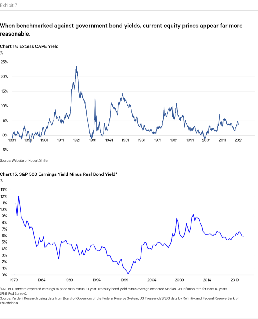
In order to account for the effect of low interest rates, Shiller and his co-authors introduce a metric they call Excess CAPE Yield (“ECY”) which in their own words “considers both equity valuation and interest-rate levels. To calculate the ECY, we simply invert the CAPE ratio to get a yield and then subtract the ten-year real interest rate.” In essence, the ECY measures the spread between the risk free rate and current equity market yields. A higher spread implies lower relative valuations for equities, whilst a tighter spread signifies the opposite. What did they find?
Interestingly, the authors found that “ECY is close to its highs across all regions and is at all-time highs for both the UK and Japan…This indicates that, worldwide, equities are highly attractive relative to bonds right now.”
As mentioned, the article has created much clamour amongst participants, particularly since it came from the “father” of the CAPE ratio, which has been used in recent months by many to argue that we are, in fact, in the midst of a bubble. But the concept in and of itself is not novel. As the authors themselves acknowledge, it builds upon a broader concept referred to as the “equity market premium” which, as per Investopedia, “refers to an excess return that investing in the stock market provides over a risk-free rate.” Calculating the equity risk premium is not a precise exercise, since it implies assumptions and simplifications for both equity market returns as well as the risk free rate1, but in practice most analysts use the S&P 500 or other common stock market indices for equity returns, and U.S. Treasuries for the risk free rate. So using a paper published only a few days ago, we can see how the current equity risk premium stands at between 5.5%-6.0%, which is in line, or a bit higher than historical averages, again suggesting that current valuations are not without sense given where interest rates are.
We may therefore have found our answer to why stock market valuations are so high: interest rates. Case closed? Not so fast.
Are Low Interest Rates the Answer to Current Valuations?
As mentioned above, the idea that equity market valuations should be driven, in part, by interest rates is not novel. Academics note that the Institutional Brokers’ Estimate System has published a metric since 1986 called the I/B/E/S Equity Valuation Model which builds on this concept. But the notion really burst onto the scene in the late 1990s when, in the context of the then-forming dotcom bubble, Fed chairman Alan Greenspan began publicly acknowledging the relationship between the forward earnings yield on the S&P 500 Index and the 10-year Treasury yield in assessing levels of equity market over-or-under valuation.
Noting his comments, Deutsche Morgan Grenfell analyst Dr. Ed Yardeni (now of Yardeni Research, whose estimates for the equity risk market premium are used in the exhibits above) coined the term “Fed Model” to refer to this framework. Whilst the term was never officially endorsed as a metric by the Fed, Greenspan and other subsequent Fed chairmen have referenced it, suggesting its importance in the eyes of the central bank.
The Fed Model, and the broader concept that equities should be priced off of interest rates, is a controversial one. Many argue that the Fed Model is fundamentally flawed, both in theory and in practice, and has little predictive forecasting power. Who’s right?
Arguments in Favor of the Fed Model
Let’s first review the arguments in favor of the Fed Model. There are essentially three:
Competing Assets Rationale: Investors can choose between investing in stocks and bonds. When the yield on bonds falls, equity returns become more attractive and money should therefore move out of bonds and into stocks, thus driving up P/E values.
Present Value Argument. As we discussed earlier, the price of a stock should be equal to the present value of future income derived from it. If interest rates fall, so too do the discount rates used to calculate present value, thus increasing the PV.
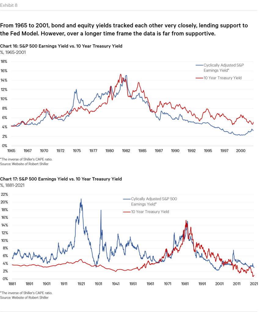
Supporting Data. The final argument used to justify the Fed Model is empirical. For a large stretch of time, earnings yields (i.e. the inverse of the P/E ratio) and Treasury yields tracked each other beautifully. Between 1965 and 2001, the correlation between the two yields was an impressive 0.81 (see Exhibit below).
Arguments Against the Fed Model
The most commonly cited paper in discussions against the validity of the Fed Model is one published in 2003 by famed investor Cliff Asness of AQR Capital Management. Most of the arguments against the Fed Model either rehash or build upon his arguments, so I’ll focus primarily on his article. His argument can be summarized in two parts.
The first leg of his argument is that the Fed Model is theoretically flawed. If we go back to financial theory, the value of a stock should be the present value (“PV”) of the income generated by such stock. This is referred to as the Dividend Discount Model (“DDM”), in that it calculates the PV of future dividends of a stock. As we’ve discussed, lower treasury rates imply a lower discount rate and therefore a higher PV.
However, as Asness argues, this idea fails to take into account the effect of lower rates on future nominal cash flows. In Asness’ view, nominal future cash flows from stocks are highly correlated with inflation. He goes on to cite data showing the strong link between the two, and also cites several other papers that show the same thing. In fact, in his own words “one of the tried-and-true reasons to own equities is the belief that stocks are a good long-term inflation hedge.”
If nominal future earnings do indeed track inflation, then in Asness’ argument lower rates should therefore lead naturally to lower future nominal earnings growth. This is because lower interest rates occur precisely because future inflation expectations decline. In his argument therefore, whilst lower rates would indeed lower the discount rate applied to future cash flows, but the future cash flows would also fall, thus negating the effect of lower discount rates. In his own words:
“It is absolutely true that, all else equal, a falling discount rate raises the current price [of stocks]. All is not equal, though. If when inflation declines, future nominal cash flows from equities also falls, this can offset the effect of lower discount rates. Lower discount rates are applied to lower expected cash flows.”
The second leg of Asness’ argument is that the Fed Model is also flawed from a practical standpoint. As he discusses, changes in inflation have important second-order effects on stock prices that need to be considered. He for instance cites the effects of capital gains taxation and depreciation (which is taken at historical cost) which in fairness, as he points out, should support the idea behind the Fed Model that P/Es and rates should be linked. But he also discusses how inflation influences the accounting of short-term financing costs, which works the other way to the Fed Model. He also makes the more general point that extreme levels of inflation (either high or low) lead to greater uncertainty, which should affect the risk premium demanded by equity investors. His broader point is therefore that the Fed Model’s simplistic argument that, all else equal, falling rates raise the price of future earnings is false, because all else is not equal.
Perhaps more significantly, he goes on to show data that throws into question the relationship between interest rates and stock prices. If we recall the earlier chart, but extend the period in question, one observes that the relationship, whilst certainly evident in the period earlier analyzed, is not at all apparent in other periods.
Asness’ broader point that lower rates should lead to lower expectations of future nominal cash flows is one that is referenced by several other commentators. George Minack of Minack advisors for instance published data showing that whilst lower rates do indeed lead to higher P/E’s, when rates fall to exceptionally low levels this relationship reverses, and P/E’s start to fall again. This is because exceptionally low rates imply fundamental problems for the economy and therefore future growth prospects. Similarly, Albert Edwards of Société Générale, a notoriously bearish analyst, made a similar observation referencing the experience of Japan and Europe where lower bond yields have been followed by lower P/E’s, again because such low level of bond yields are associated with a sluggish economy.
Putting Everything Together
This post, and the one that preceded it, started because I was trying to make sense of current valuations to take a view on how they may move going forward. And as we’ve seen, most standard measures of current market valuations (ones that compare price to underlying earnings) suggest that the market is currently overvalued. But as we’ve also seen, there is a potential logical justification for current prices: low interest rates. This has in fact been the dominant theme in much of the current market commentary. Nevertheless, there is significant debate around this point, and many believe that this argument is flawed, either theoretically (Asness’ argument), or practically (in that lower rates imply sluggish future growth). With all this in mind, it’s time to draw some conclusions.
Since I’m no expert, in these situations I think it helps to go back to basics. As we’ve now discussed multiple times, stock valuations are the ratio of price to future earnings estimates, the P/E ratio. A higher price makes sense if the denominator in the equation, E, also rises. Why could it rise? For two reasons: either (A) because fundamental growth expectations for E improve, or (B) because the discount rate applied to E when calculating its present value falls. If (A) instead falls, or (B) rises, then price should fall.
Let’s start by focusing on (B). If we agree that lower rates do indeed raise E in our equation, then it is fair to assume that higher P is justified. Of course, this rests on the assumption that all else remains equal, which as we’ve discussed above is a highly contentious argument. But casting aside the debate for a moment, the more important point to remember is that interest rates are currently near zero. This therefore means that the positive effect of falling interest rates on valuations is essentially exhausted. This is not strictly true, since the 10Y Treasury is currently around 1%, meaning it could still fall, but that’s little further room for improvement. They could also theoretically fall below zero, but that’s a whole different can of worms which I prefer to avoid for now. So in summary, even if lower interest rates do indeed justify higher stock prices, this effect has been used up and going forward only has one possible direction to go: the other way. So from a purely discount factor standpoint, valuations can either remain as they are, or fall.
The discussion therefore now turns to (A). This is a much more complicated one to assess, but let’s have a go. First of all, as we’ve noted, there are reasonable arguments to be made that earnings growth should necessarily fall with lower interest rates, either because of the effect of lower inflation on nominal earnings growth (Asness’ argument) or because lower rates imply problems to the economy and therefore sluggish growth going forward. Focusing on Asness’ argument first, I find his reasoning compelling and significant but not bullet-proof. Firstly, it assumes a one-to-one connection between rates and inflation. This is reasonable, but not necessarily true. Rates have fallen, but perhaps the inflation expectations built in to valuations were already lower to begin with. So perhaps rates have simply caught up with inflation expectations as opposed to the other way around (which is what he argues). More importantly, his argument hinges on the idea that future nominal cash flows from equities track inflation closely. Whilst his data shows that this may be true, he himself acknowledges that data post 2001 shows a weaker correlation, and that other studies have found similar findings to his, but with less strength in the correlation and with considerable differences by industry.
I think the crucial part of the assessment centers around expectations for “true” earnings growth, i.e. that caused by growing revenues, higher profit margins, underlying economic growth, etc. This is where it becomes more difficult to make predictions. On the one hand, the devastating toll of the pandemic is unlikely to have yet fully materialized. The level of “economic scarring” may be significant. On the other hand, it seems clear that the U.S. and other developed economies are likely to hit the accelerator on major fiscal stimulus, theoretically igniting a period of higher economic growth in the years to come.
Frankly, I don’t feel in a position to make a call on the above. My gut feeling is that strong, sustained earnings growth will be difficult to achieve. But it is theoretically possible. I would however note that if this were to occur, at that point we could potentially face rising inflation, which would in turn cause interest rates to rise. This would therefore negate the effect of earnings growth on valuations.
To summarize: in order for valuations to continue to rise from here, we would need to see sustained earnings growth coupled with stable or falling interest rates. Since sustained earnings growth is possible but difficult, and that rates really have only one way to go from here (up), I see more downside risk than upside potential for valuations going forward.
_____________________________________________________
1 A 2015 paper by Fernando Duarte and Carlo Rosa for the New York Federal Reserve discusses the challenges of calculating the equity risk premium in further detail.